Understanding the Paramount Network Logo
The paramount network logo has become an iconic representation of a network that stands for high-quality entertainment. Understanding the intricacies of this logo goes beyond just its aesthetic appeal; it delves into the history, design principles, and strategic importance behind it. In a world where branding matters significantly, the logo plays a crucial role in defining the essence of the brand it represents.
History and Evolution of the Logo
The Paramount Network logo has gone through various transformations since its inception. Originally launched as the “Spike” channel in 2003, the logo featured bold and aggressive typography reflective of its target demographic—male audiences interested in action programming. However, as the channel evolved and rebranded to Paramount Network in 2018, the logo also underwent a significant redesign to align with its new identity and programming focus.
The new logo retained elements from its predecessors, primarily integrating the iconic mountain image, symbolizing the heritage of the Paramount brand. This image, steeped in Hollywood lore since 1912, rekindled a sense of nostalgia while embracing modernity. The transition marked a pivotal shift—focusing on more diverse storytelling and audience engagement.
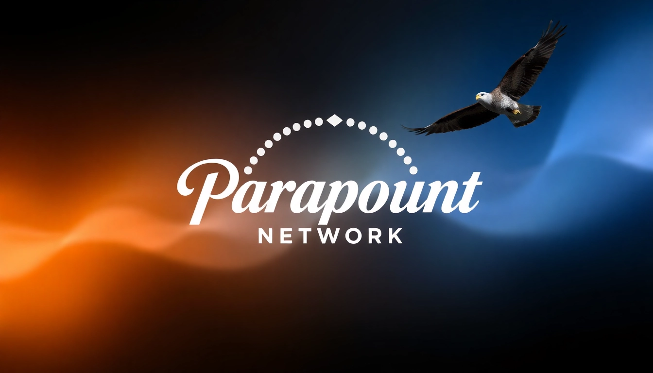
Key Elements of the Design
At the heart of the Paramount Network logo are its fundamental design elements: color, typography, and imagery. Each component seamlessly combines to evoke a robust visual identity. The dominant colors—blue and white—are not only visually appealing but also communicate trust, calmness, and professionalism.
The distinctive mountain illustration featured in the logo is not merely decorative—it symbolizes the network’s dedication to providing high-quality, all-encompassing entertainment that reaches new heights. Contrasting with the mountain is the bold sans-serif typeface used for the text, which conveys strength and clarity, making the brand instantly recognizable.
Symbolic Meaning Behind the Logo
Beyond its visual appeal, the Paramount Network logo embodies multiple layers of meaning. The mountain image serves as a metaphor for aspiration and ambition, reflecting the network’s aim to provide premium content that resonates with viewers. The stars encircling the mountain evoke Hollywood’s glamour, associating the network with cinematic excellence and storytelling prowess.
Furthermore, the use of bold typography signifies confidence and accessibility, making the brand approachable while still maintaining a level of sophistication. This thoughtful integration of symbolism and design communicates not just what the network is about but also how it wants to be perceived by its audience.
Design Principles Involved in the Paramount Network Logo
Color Theory Explained
Color plays a crucial role in branding and logo design, and the Paramount Network logo is a testament to this fact. The blue tones used in the logo are associated with dependability and trust—qualities that viewers seek in their entertainment. The choice of white as a complementary color enhances the logo’s visibility, ensuring that it stands out in various contexts.
Additionally, studies in color psychology suggest that blue is calming and can evoke a sense of serenity, making it appealing to a broad audience. This strategic choice enables the Paramount Network to position itself as a trustworthy source of entertainment while enhancing viewer retention and loyalty.
Typography Choices that Matter
Typography is another pivotal aspect of the Paramount Network logo’s design. The sans-serif font chosen is not only easy to read but also modern and clean, aligning with contemporary branding trends. The absence of serifs instills a sense of clarity and straightforwardness, essential for effective communication in a crowded entertainment landscape.
Moreover, the bold weight of the typography conveys strength and assertiveness, suggesting a forward-thinking and confident network. The decision to leverage a minimalistic approach in typography also reflects a broader trend in logo design that favors simplicity for greater memorability.
Layout and Composition Techniques
The layout of the Paramount Network logo is meticulously crafted, employing ideal composition principles to create balance and harmony. The mountain is positioned centrally, drawing the viewer’s eye immediately to the focal point of the logo. Surrounding the mountain, the stars provide a visual buffer that adds texture without overwhelming the central image.
This strategic composition allows the logo to maintain its integrity across multiple applications, whether on television screens, digital platforms, or print materials. The adaptability inherent in the design ensures that the logo remains effective, no matter the medium or size, enhancing brand visibility and recognition wherever it appears.
Using the Paramount Network Logo in Branding
Integration Across Various Media
In today’s multifaceted media landscape, consistent integration of the Paramount Network logo across different platforms is paramount for brand recognition. From billboards to website headers and social media profiles, maintaining a uniform logo application is essential.
For effective media integration, brands should establish clear guidelines that dictate logo usage, including specifications for color, size, and placement. This ensures that the logo retains its integrity across all touchpoints, creating a cohesive brand experience that resonates with viewers and reinforces brand loyalty.
Consistency in Brand Messaging
The Paramount Network logo is not just a visual identifier; it is an integral part of the network’s messaging. Consistency in how the logo is used contributes to a unified brand voice, which is essential for nurturing audience relationships. The message encapsulated within the logo—quality entertainment and a sense of adventure—should be echoed in the network’s programming and promotional materials.
This coherent messaging establishes clear expectations for viewers, which aids in the creation of a loyal audience base. By ensuring that all promotional content is aligned with the logo’s design and associated messaging, the Paramount Network enhances its overall brand perception and market positioning.
Engagement through Logo Recall
Engaging audiences to the point of recall is a significant goal in branding, and the Paramount Network logo is designed to facilitate this connection. Research shows that logos that are simple yet memorable enhance brand recall, which is critical in a competitive media landscape.
Efforts to cultivate logo recall can include strategic marketing campaigns, interactive content, and social media engagement that invite viewers to connect with the brand on a personal level. The more viewers associate the logo with their viewing experiences—whether through memorable programming or emotional storytelling—the more likely they are to recognize and recall the brand swiftly.
Comparative Analysis with Competitor Logos
Highlights of Successful Logo Designs
When analyzing successful logos within the entertainment industry, a few commonalities emerge. Successful logo designs often reflect clarity, adaptability, and emotional resonance. For instance, logos like those of Netflix and Disney have solidified their identities through simplicity and powerful imagery that encapsulates their core values and themes.
Like the Paramount Network logo, these brands utilize visual cues that evoke emotion—whether it’s Disney’s enchanting castle or Netflix’s bold red “N.” The effectiveness of these logos demonstrates the importance of creating a design that is not only visually appealing but also conveys a deeper connection with its audience.
How the Paramount Network Logo Stands Out
What sets the Paramount Network logo apart in the crowded field of entertainment branding is its unique blend of heritage and modernity. While many networks lean heavily on flashy graphics or overly complex logos, the Paramount Network opts for a more traditional approach, focusing on a powerful icon that speaks to the network’s historic roots in the entertainment industry.
The use of the mountain symbolizes not only ambition and quality but also ties back to the powerful storytelling legacy associated with Paramount Pictures. This strategic distinction can be leveraged as a point of connection to longtime fans while attracting new viewers seeking compelling content.
Lessons from Competitor Branding Strategies
In observing competitors like HBO, CBS, and Netflix, key lessons can be derived regarding logo execution and brand strategies. For instance, HBO’s combination of minimalism and stark contrast appeals to a sophisticated audience, while CBS utilizes a simple yet effective eye symbol that is easily identifiable.
The Paramount Network logo’s success can be attributed to its alignment with the network’s content strategy and target demographic. The insights gained from analyzing competitor branding strategies illustrate that meaningful and intentional branding, along with understanding audience perceptions, are paramount for success in today’s entertainment landscape.
Future Trends in Logo Design
Emerging Design Trends Prevalent in 2024
As we look to 2024, emerging design trends suggest a shift towards more dynamic logos that can adapt in real-time, particularly in digital spaces. Animated logos are becoming increasingly popular, offering brands an interactive and engaging way to connect with audiences. Additionally, the use of sustainable design practices is rising, reflecting a growing consumer preference for brands that advocate for social responsibility.
Exploring these trends will provide valuable insights for the Paramount Network as it continues to evolve alongside changing consumer preferences while remaining true to its brand heritage.
Impact of Technology on Logo Creation
Technology plays a crucial role in shaping the landscape of logo design, impacting both creativity and the execution of branding strategies. The rise of AI tools has made logo creation more accessible, allowing brands to experiment with designs rapidly. Furthermore, augmented reality (AR) and virtual reality (VR) applications are paving the way for interactive branding experiences that can elevate viewer engagement.
For a brand like Paramount Network, leveraging advancements in technology means finding innovative ways to utilize its logo across platforms, enhancing user interaction while deepening audience connections.
Anticipating Changes for Branding and Identity
As branding continues to evolve, anticipating changes in how logos and identities are forged is essential for future success. Brands will need to focus on emotional branding, where the logo serves as a touchpoint for deeper consumer connections. The Paramount Network can achieve this by fostering community-building strategies that allow audiences to engage with the brand more meaningfully.
Highlighting storytelling through visuals, integrated media strategies, and responsive designs are likely to become fundamental approaches to ensure logos remain relevant in an ever-changing entertainment landscape.